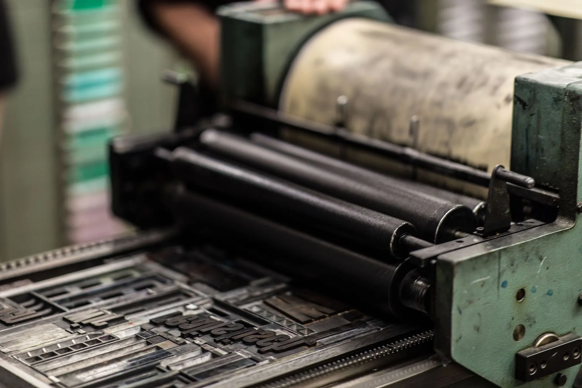
I used to lose afternoons to this. A manuscript arrives, I try three faces at three sizes, dislike all nine, and by six o’clock there is a folder of samples on the desktop and no page. The next morning I would start again with a fourth face, as if the problem had been the typeface all along.
What ended those afternoons was giving up the idea that the typeface comes first. The measure comes first. Everything else on the page is a consequence of it, and once I started setting it before anything else, the afternoons got shorter and the pages got better.
What the measure is doing
The measure is the length of a line of text. It sounds like a small decision, a width in a layout, and it is treated like one: whatever is left once the sidebar and the margins have taken their share.
But a reader’s eye does two things with a line. It sweeps along it, and then it returns to the start of the next one. The sweep is cheap. The return is not. It has to find the right line, a little lower, at the far left, without losing its place, several hundred times a page.
A long line makes that return unreliable. The eye lands on the wrong line, rereads a line it has already read, or skips one, and the reader experiences it as fatigue without knowing why. A short line makes the return so frequent that the sweep never gets going, and reading turns into a series of small interruptions.
Between the two failures there is a range, narrower than people expect: about fifty characters to about seventy-five, spaces included.1 I work at sixty-five.
Everything downstream
Fix the measure and watch what falls out of it.
The size is no longer free. A given measure wants the size that puts about sixty-five characters in it, and a face with a large x-height will want a slightly smaller size than a face with a small one. You are no longer choosing a size you like; you are choosing the size the measure asks for.
Nor is the leading free. Longer lines need more space between them, because the return journey is longer and a little more white space between lines helps the eye find the next one. Shorter lines can be set tighter. The leading follows the measure like a shadow.
The margins stop being decoration and become what is left of the sheet once the measure is placed. On a screen, the margins become whatever the viewport has to spare, which is why a good screen page looks generous on a laptop and exactly right on a phone.
That is the point where people say typography is subjective. It is not subjective. It is coupled. Each decision constrains the next, and the only real freedom is in the first one.
Why the typeface is the wrong place to start
A typeface chosen first is a typeface chosen in the abstract: in a specimen, at display size, set in a single line that says something about a quick brown fox. It looks one way there and another way at sixty-five characters, eleven points and a leading of 1.5, because at that size you are no longer looking at letters. You are looking at the grey of the paragraph.
Chosen after the measure, the face is tested where it will actually live. Nine samples become three, because six faces obviously do not work at that size on that line. The folder gets smaller.
The argument this settles
Most complaints about a page resolve to a measure nobody chose. “Cramped” is usually a short measure with too little leading. “Thin” is usually a long measure at a small size. “Fine on a laptop and awful on a phone” is almost always a measure set in pixels by someone who never saw it on a phone.
So I set it first, and I set it in characters rather than in pixels, because characters are the unit the reader is working in. On this site the body text sits in a column 66 characters wide, stated in ch so it survives a reader enlarging the type.2
You are reading the argument in its own conclusion. If it has felt easy, the measure is doing its job; if you had to work, write and tell me on what screen.
Footnotes
-
The figures vary a little by source and by language. German, with its long compounds, tolerates a longer line; languages set in short words tolerate a shorter one. ↩
-
A
chis the width of the zero in the current font. It is a rough stand-in for an average character, which is exactly what a measure needs. ↩