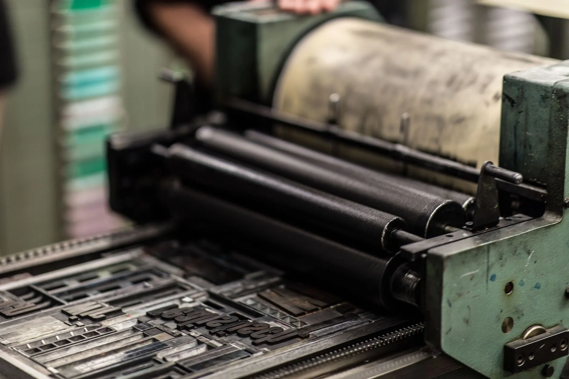
Everyone photographs the type. Nobody photographs the ink.
It sits in a tin with a skin on it, the colour of nothing in particular, and it is the only part of the process that touches both the metal and the paper. Get it wrong and the type is irrelevant.
What wrong looks like
Too stiff and it will not take up on the rollers evenly. On the proof that is a mottling across the solids, and the instinct is to blame the packing or the pressure, neither of which is the problem.
Too loose and it spreads under impression. The counters fill, and a page turns into a grey slab at reading distance. That is the failure that makes people say metal type is hard to read. It is not the type.
The part that is not technique
A press day has a temperature, and the ink knows it. In a cold shop in January the same tin behaves like a different material than it does in August, and the correction is not written down anywhere useful. You warm it, or thin it, or wait.1
The variable is continuous, the feedback is slow, and the only instrument is the proof.
Why it matters away from a press
Because the same is true of a screen, and we pretend it is not. The blackness of type on a display is a function of stroke weight, size, rendering engine, panel and room. A page that looks right on the machine it was made on can look thin on another.
The fix is the same fix: look at it somewhere else, at the size it will be read at, before you decide.
Footnotes
-
The printer who taught me kept the ink tins on a shelf above the radiator from November to March. It is the most useful thing anyone has told me about ink. ↩